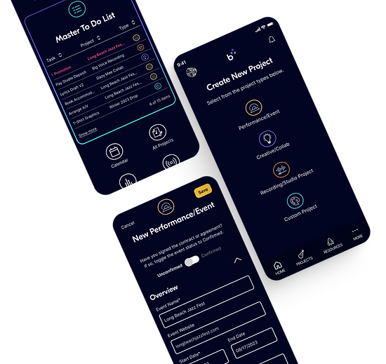
END-TO-END MOBILE APP
DesignRush 2025 best app design nominee!
Ready to have some fun? Explore the interactive prototype. Follow the user flow instructions in the left side panel for the end-to-end experience.

The all-in-one project management tool helping indie bands and artists more efficiently self-manage and promote.
Project Type
End-to-end mobile application
My Roles
UX Research, Strategy & Design; Branding; UI Design; Prototyping
Tools Used
Figma; Figjam; Adobe Illustrator; ChatGPT

Final Result
In this case study, I'll show you how I designed a research-informed, prototype-tested project management mobile app that helps bands more effectively self-manage and promote, so they can build their income and grow their business.
But it didn't happen in a straight line.
Design Thinking Process
There are a lot of moving parts in an end-to-end app design, so I leaned on the Design Thinking process -- a solid framework to guide me through clearly defining the problem, then planning, designing, and testing the right solutions.
Define
Research Synthesis: Affinity Mapping Persona
POV/HMW
Ideate
Ideation
Feature Map
Sketches
Architecture
Prototype
Wireframes
UI/Branding
Interactive Prototype
Test
Usability Testing
Iteration/Revision
Empathize
Project Brief
Competitive Analysis
User Research
Project Background
🤔 Reflecting on my own early experiences as an indie music artist, I often struggled - and saw others around me struggling - with marketing ourselves - our businesses! As creative types, we spend hours a day honing our craft, while marketing and promotion remain a dark, scary hole. 🕳️
I knew there would be problems to solve in this area, and that effective fan engagement and promotion are crucial to a band's success.
Initial Focus:
Artist-fan engagement, marketing, and management
Fan-artist & fan-fan community engagement
Research Plan
I set out to verify that there existed a need and a desire among the independent artist community (who market their content directly to consumers) for a private platform that helps bands and solo artists effectively engage with and promote to their fans.
What other products were out there?
For examples of band/artist D2C (direct to consumer) apps or products and ideas of how I could improve existing efforts to solve problems in this space, I needed to do a competitive analysis.
What problems could I solve?
In order to identify key problems to solve in the band-fan engagement process, I would need to interview two different user groups: bands and fans.
Musicians' Goals
Learn more about bands' needs, pain points, and experiences with regard to artist-fan engagement, marketing, and relationship management
Consumer/Fan Goals
Learn more about fan groups' needs, pain points, and experiences with regard to the "fan" experience, artist-fan and fan-fan engagement
Assumptions
Musicians want to make a living through music.
Just like everybody else, bands want to be compensated for goods and services they provide.
Bands would engage with fans through an app.
Bands/artists would find value in engaging with their fans through a private platform app and would do so consistently.
They subsist on fan support.
Fan support (resulting in sales) is key to most independent artists' ability to earn money.
Fans would engage with bands through an app.
Regardless of their current methods, fans will want to engage with their favorite bands through an app.
They would use an app to monetize.
Bands would use an app as a primary platform to build revenue from their products and services.
Social media sucks.
Both bands and fans want a private, secure alternative to social media as a platform for engagement.
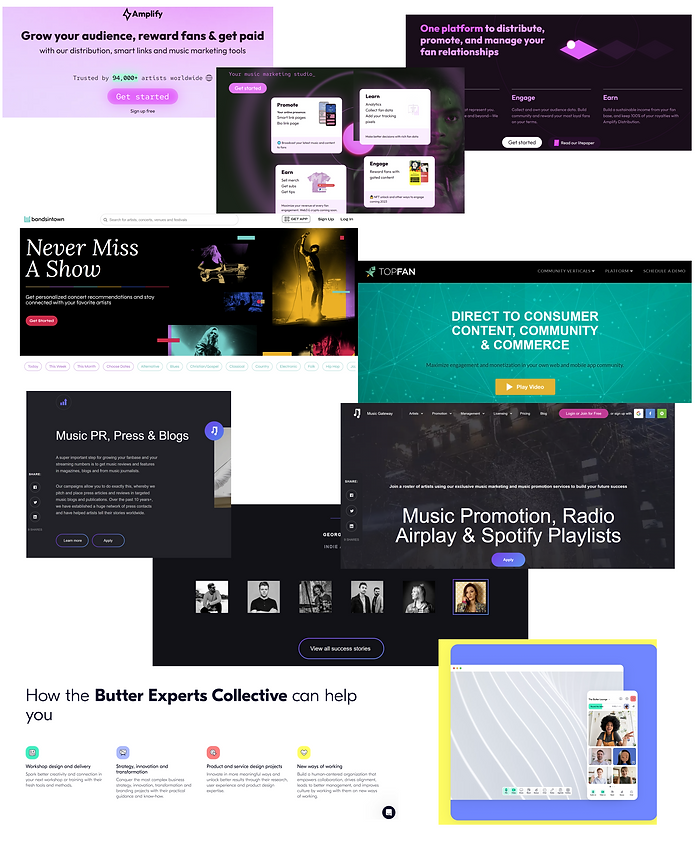
Competitive Analysis
After extensive desk research, I found a few D2C artist-fan engagement platforms.


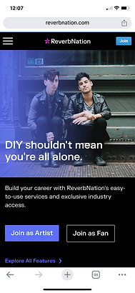
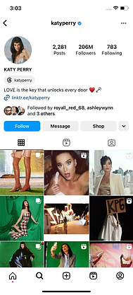
Other than Instagram, the platforms I did find were either geared toward mid-to-large-tier artists (TopFan and With the Band, requiring 150k fans minimum) or were waning in popularity, such as ReverbNation.
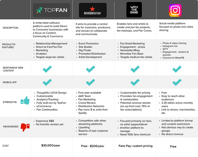
Competitive Analysis Takeaways
There are few private D2C platforms for independent artists.
White label promotion & engagement apps are inaccessible to most small DIY artists.
Social media is the ubiquitous "band-aid" for fan engagement.
User Research
Looking at this as a potential D2C (direct to consumer) product, I conducted interviews with an equal number of musicians and fans.
I organized the feedback using an affinity map for each user group, focusing on motivations, struggles, existing strengths, and values. (I find that values are super-important in making buying decisions.) I also looked at how they're currently interacting, engaging, or promoting (on the musician side) and spending (on the fan side).
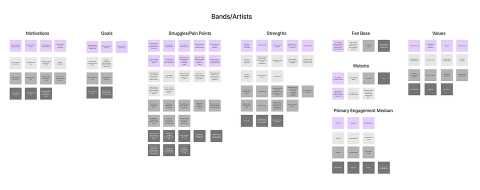
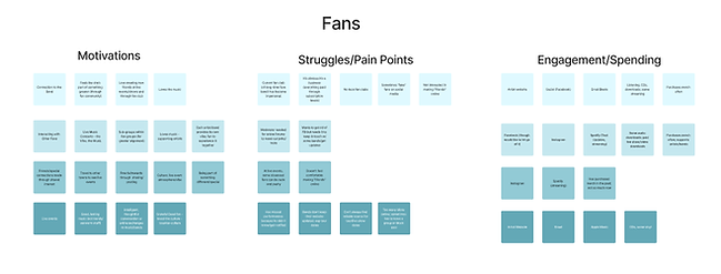
Interview Takeaways
Musicians had a lot of shared pain points.
-
Marketing/Promotion (lack of knowledge, time, and/or funds)
-
Difficulty generating income, largely due to changes in the music industry
-
Time Management
-
Social Media Concerns
Fans were pretty content.
-
They enjoy feeling part of something "special" or bigger
-
They love the music
-
They are excited by the live event atmosphere / culture
-
They enjoy easy access to streaming music
Social media is a "necessary evil" everybody has learned to live with.
-
All musicians/bands interviewed are "invested" in their social media lists and use it as their primary means of fan engagement
-
Most bands grudgingly use it (due to a lack of other viable options)
-
They don't know how to use it to monetize
-
Fans use social media for news and to connect
-
Fans had some concerns about social media but it was more about the lack of forum moderation / the few "idiots" who are out there
The Opportunity
The interview findings were clear: since fans I interviewed had few real, tangible pain points, the greater opportunity was in serving the many needs and pain points of independent bands and musicians.
Fans
Bands
I'm not great at self-promotion and I can't afford a manager, but I don't have time to learn all the hacks.
GC
Sometimes on the day of a performance I’m horrified to realize I never sent an email to fans to promote it. I need some kind of plan.
LS
Streaming services have killed music sales for smaller artists. We need creative solutions for generating income or we won’t be able to survive.
JW
Personas
Taking findings and insights from the research, I reassembled the data into two personas that were representative of characteristics of all four users interviewed. This set of artifacts helped keep the humans I was designing for front and center.
The personas highlight:
-
Pain Points (what are their struggles/areas of opportunity?)
-
Behaviors (what does the user do on a daily basis and how might the product fit?)
-
Jobs To Be Done (which goals invite actionable solutions?)
-
Platforms/Apps Used (which services or apps are they familiar with, and which might sync to the bandrise platform?)


Persona Takeaways
Organization and planning are key
Both users need help getting (and staying) organized and planning steps to success.
Need help with promotion and marketing
Making a living from music is important to both users. They need inspiration and guidance on effective solutions to financial success.
Needs to be easy to set up and manage
While one user is a little more tech-savvy than the other, they both would benefit from a simple, straightforward design - something that will provide immediate positive reinforcement and that won't require a huge learning curve.
Problem Finding
Crafting problem statements based on the persona's primary motivations, values, and pain points helped define the user and the specific problem on a more granular level, putting me in a goal-oriented mindset for feature ideation.
How might we help independent bands and musicians...
Feel empowered and excited about managing their business?
Create actionable, attainable goals?
Adopt easy, affordable practices for more effective organization, management, and promotion?
Discover and implement new ways to make money?
Ideation with AI
From the beginning of my discovery and research process, I used ChatGPT to research competitor apps and websites, enhance the ideation process, and inspire some content ideas.
I fact-checked any products or companies generated, and measured any feature ideas against the personas and data synthesis to be sure it would be a fit for my user base.


Defining the Features
Between ChatGPT and my own brainstorming sessions, I had no lack of ideas for features. (As we know, ChatGPT tends to go overboard with ideas and detail.) But to limit it to MVP (minimum viable product) launch, with research-backed, viable product features, I prioritized each feature idea by impact (on business, user needs) vs. effort (tech, resource, or other constraints) to determine:
How does it benefit the user?
Is it research-supported?
Which business or user goal does it meet?

Feature Priorities
Dashboard or mission control screen
Focus on event promotion
Ability to create projects and view details in one place
List of default action items
Professional solutions to help with distribution and revenue
Architecture
Once the launch features were prioritized, I needed to determine the hierarchy and some of the flows and interactions.
I used Figjam to map out the screen architecture, along with some key flows I wanted to eventually test with users.

Key Screens
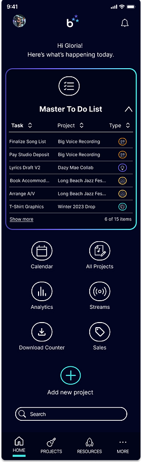
Home Dashboard
Gives users a quick at-a-glance overview and ability to tap through to view more detail.
To Do List
Keeps users organized and on task; prominently accessible via the home dashboard.
Add a New Project/Deal
Also prominent on the home dashboard, it allows users to add new project details and build their to-do list.
Current Project List
This gives users an overview of all current projects

Adding a New Project (formerly called "Deal")
This is the first step in getting organized in setting and managing day-to-day activities.
-
Flexibility: users can select from common 3 project types (or add a custom project type, if any project doesn't fit into a pre-designed bucket).
-
It offers two stages for new projects: "confirmed/booked" or "prospect," which allows future project ideas or submissions to be documented and show up in the pipeline.
-
Saving the project triggers the users' first to-do list.
-
To minimize overwhelm, to-do lists are chunked into project stages
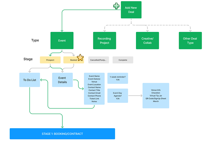
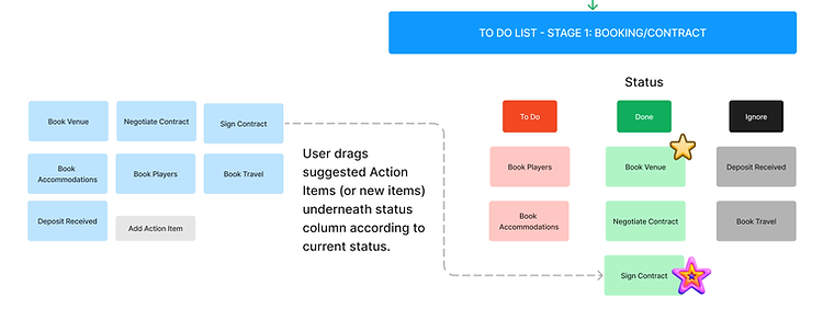
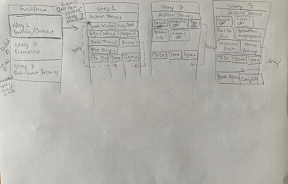
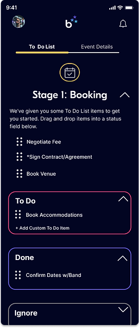
Building a To Do List
Stage 1: Event Booking
-
To streamline organization and reduce clutter, I added dependencies, so certain completed actions are inactive until triggered by the related action item.
-
To reduce cognitive load and save time, bandrise offers a default suggested list of action items to set them up for success.
-
For ease of use and as a visual aid, items can be moved under a progress status
-
For added personalization, users can add customized action items
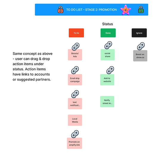
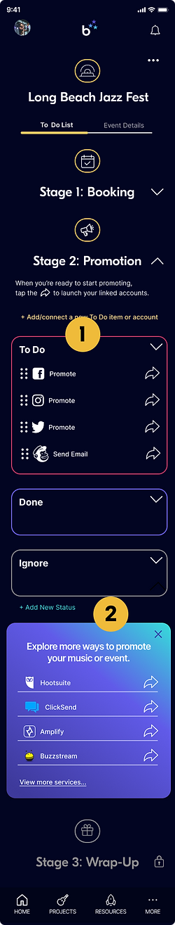
Stage 2: Event Promotion
This addresses and streamlines many common pain points and can act as a learning moment, providing musicians with a starter kit of promotional tools and methods by prompting users to link their email, social accounts or affiliate links for direct-to-platform promotion. They can also "ignore" it for the time-being but early user feedback showed users wanted to keep a to-do item visible, in case they want to come back to it.
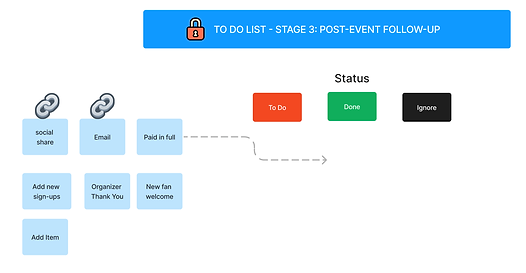
Stage 3: Post-Event Follow-Up
I can attest from personal experience, this is an important but often forgotten or ignored step!
-
After the event date passes, the Post-Event Follow-Up action items change state from inactive to "available."
-
Users can select from a list of action items to help with post-event tasks, including thanking the organizer, welcoming new fans, sending an event summary email, etc.
Sketches
Once I had an idea of the basic architecture and key flows, I needed to start adding some detail using pencil and paper. I find that hand-sketching helps the flow of ideas -- and it's easy to grab the sketches for references throughout the wireframing and interaction design process.

These are the first drafts for:
-
Home dashboard
-
Navigation menus
-
“Create a new project” flow
-
Settings
-
Solution Center
-
Project dashboard (originally called "deals")
💡 Once I started sketching the mobile screen detail, I realized my initial side-by-side To Do List "statuses" on the whiteboard architectural exploration wouldn't work for a mobile layout. These initial sketches still show the side-by-side layout, but I adjusted the layout later in the wireframes.
To Do List “Stages;”
Drag & drop list item actions
Wireframes
The branding was still in process, so working in mid-fidelity (black/gray/white) allowed me to get started on the content and interactions while awaiting the final brand design. I did include a preliminary logo iteration, plus some iconography that ended up in the final high fidelity designs.
Key Screens
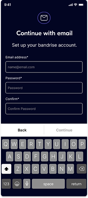
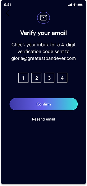
Account Set Up & Verification
Home Dashboard
Professional Solutions
Profile Set Up
Adding & Saving a New Event
Linking External Accounts
Building a To Do List
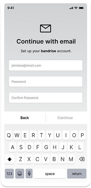
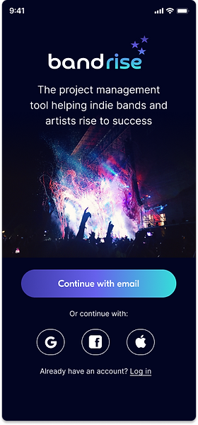
Clutter-Free, Branded Login Screen signals "You're in the right place."

Standard Account Set Up with just email and password. Confirm to reduce error.
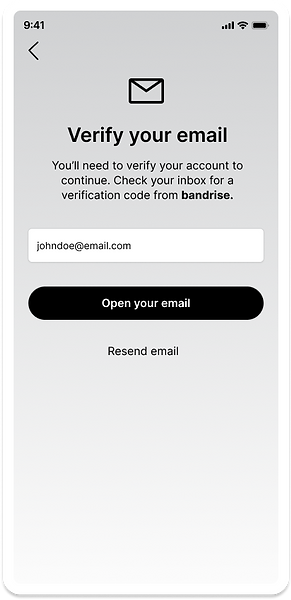
Security Step: Email Verification
This process was later simplified to a 4-digit verification screen.
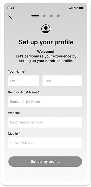
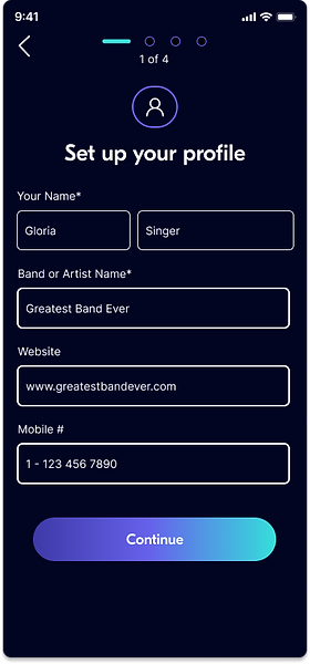
Minimal Profile Setup:
Nice and simple: Only name and band name are required fields.
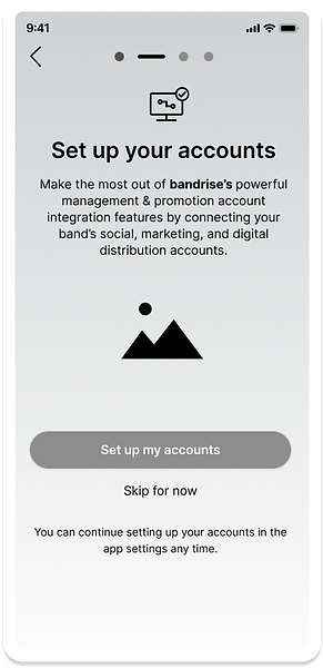
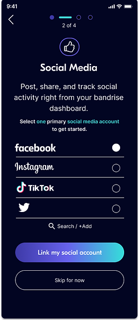
Set up Accounts:
For a more flexibile setup process, this can be skipped & done later.
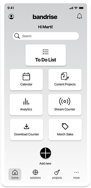
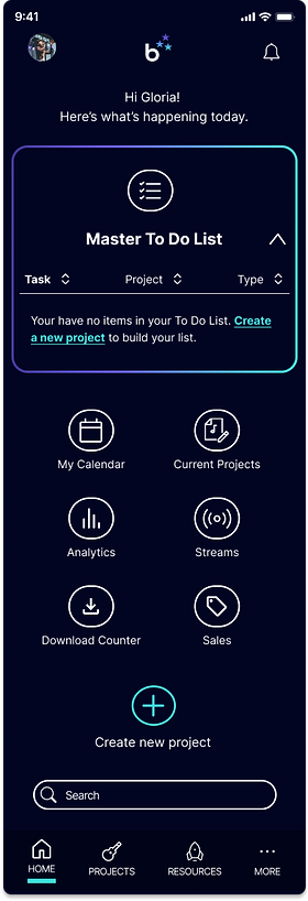
Home Dashboard:
The user has a quick view of projects and all things band management, including website analytics and digital stream count, etc (requires linking the accounts).
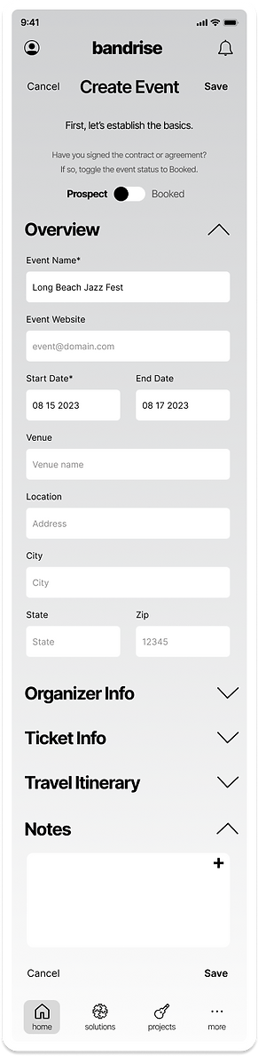
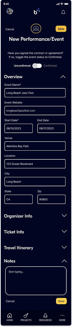
Add New Project:
For a customized experience, the user can select from 3 project types or add a custom project.

Add Event Details:
For less friction, only the event name and date are required to save an event.
Event Details Success:
To improve productivity, users are encouraged to start building their To Do List right away.

To Do List:
List item drag icon was later changed to the more recognizable rows of dots. Note the toggle option between to do list and event details.

Event Details:
From here, users can view, edit, or share event details with band members. We also added a booking feature for accommodations.

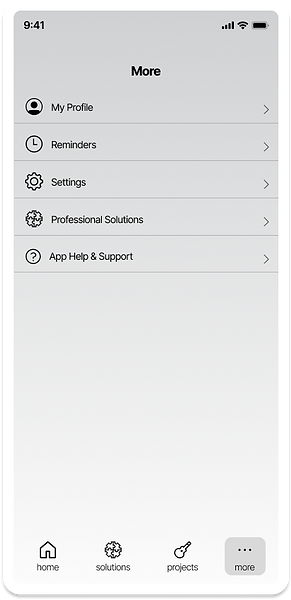
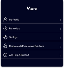
More Menu Screen:
Beyond the app tools, users can access resources & professional solutions to help them build their business, creating the opportunity for affiliate marketing!
Professional Solutions:
This wiki knowledgebase was later renamed "resources and professional solutions" due to some early confusion about what professional solutions meant.
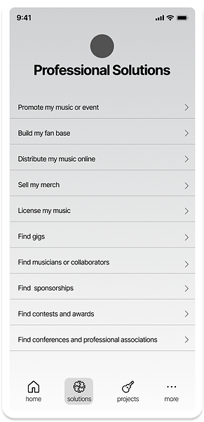
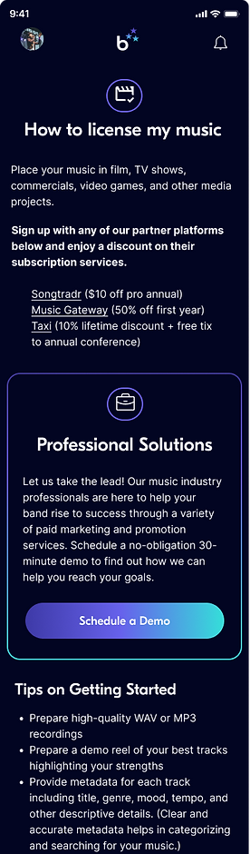
Licensing Opportunities:
Users can access information on how to license their music, plus link to affiliate companies. It provides valuable content for the user and acts as a marketing tool for bandrise and its partners.

Branding
The name "bandrise"
evokes the feeling and imagery of bands easily and effortlessly rising to success.
Lower case = friendly
One word = cohesion, unity, symbolic of a "band" or band name
Inspiration
I sought branding inspiration primarily among products offering music promotion features and services. My aim was a simple, modern, sleek, exciting, inviting interface.
Dark/sleek background; crisp white text
Pops of color to highlight features & text
Friendly line-drawn icons w color accent
Color Palette
3E3AA8
6762EC
35DFDA
C83261
FBCF60
020522
FFFFFF
Logo on dark background
Logo on light background
Design System
For stylistic consistency across screens and shorter design time and a custom look, I created a bespoke component library.
Menus & Navigation

Buttons & Toggles
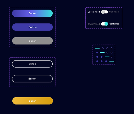
Icons, Search, Filter

Form Fields

High-fidelity Screens
As the final step before usability testing (with real users), for a real-life test drive, I wanted to make these mockups look as close to final as possible. Using Figma, I combined the branding elements with the wireframes to produce high-fidelity (full color) screens. Notice how the wireframes were like the blueprints of a house -- and this is the "model home" with all the paint and fixtures in place.
For the writing style, I chose an informal, friendly, supportive tone with positive reinforcement to match the brand and reduce any intimidation for the user, who may be unfamiliar with project management or promotions apps. They need to feel "at home" and in control of the process.
Create an Account
User Profile Setup
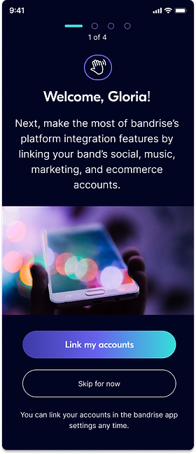
Link External Accounts

Create/Save a New Project: Event
Home Dashboard
Event saved confirmation. Option to start building a To Do List.

Create a new project: event

To Do List: dragging action items into a status field.
Sample Stage 2 Promotion with account launch action and affiliate links.

Save event details
Event details screen/tab w/help finding accommodations.

Resources & Professional Solutions
Home Dashboard: access through Resources, More, or by initiating a search.
Resources Screen

How to license my music
Usability Testing
In order to test the usability of the design and task flows with real users, I created a high-fidelity interactive prototype with seven task flows and held moderated usability tests with 4 participants with varying backgrounds.
Overview
-
4 participants, moderated
-
2 male, 2 female
-
2 with music industry experience
-
2 with a higher level of mobile app familiarity; 2 with less tech familiarity
Success Metrics
-
# of errors
-
Ease of use star rating
Testing Results
✅ Biggest Wins
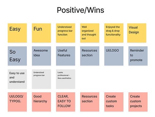
-
UI/general look and feel; logo
-
Organized
-
General ease-of-use
-
Resources section (as a useful feature)
-
Target users felt it was a useful product
⚠️ Friction Points
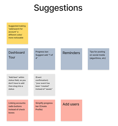

-
In profile set up, checkboxes and progress bar were confusing to some
-
Simplify "Add a to do list item” to reduce friction
-
"Add/search for account" in account linking was overlooked - needs greater affordance (make it more obvious)
-
"Resources” icon not recognizable; consider alternative
Prioritizing the Feedback & Results
-
In spite of a few glitches with the prototype drag & drop functionality, usability testing was largely successful and provided valuable user feedback.
-
I took the errors/friction points and general feedback and categorized testing data into either “feature” addition or “usability” improvement.
-
I then prioritized those improvements I felt could be accomplished with the least amount of time and effort, with the greatest impact.
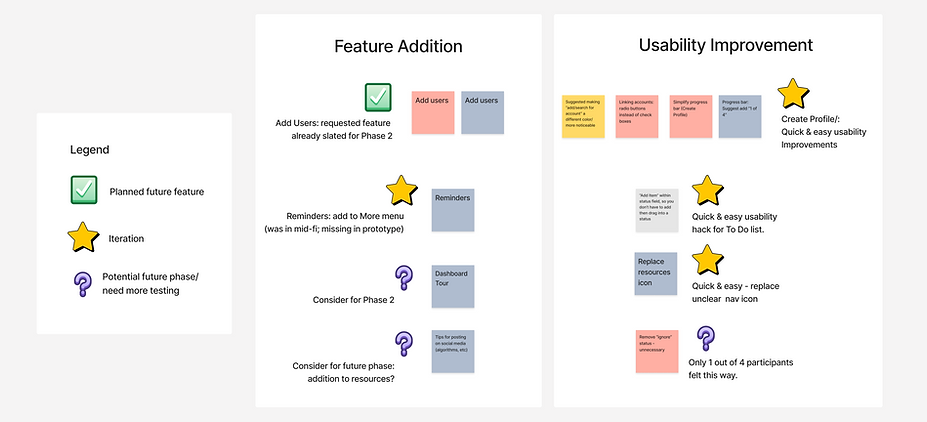
Iterations
I made and documented 7 iterations based on the prioritization matrix. One was a menu item addition (inadvertently left off of the prototype), and the others were usability improvements.
Toggle & Helper Text
Before
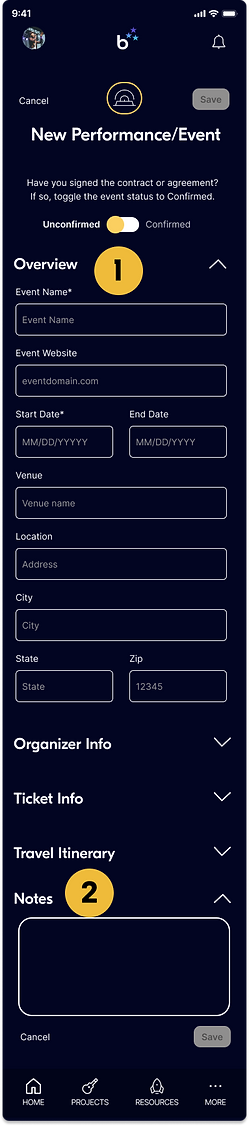
After
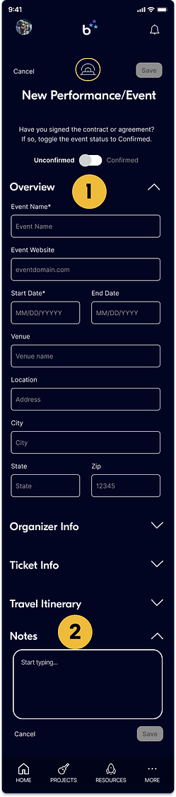
1
Greater differentiation (through visual significance) between "confirmed" and "unconfirmed" status through use of color.

2
Show helper text to reduce cognitive load.
"Link Accounts" Screen Iterations
Before
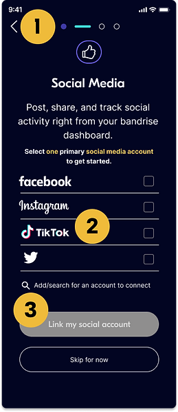
After
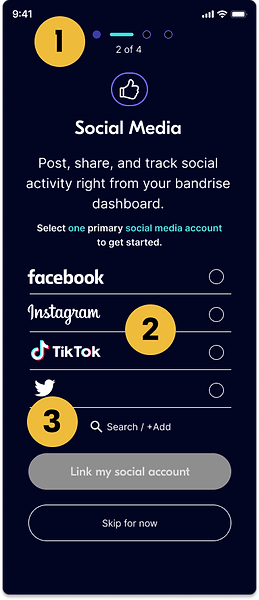
1
Simplified progress bar; added "x of x" screen #s.
2
-
Text color change for cohesion (yellow to teal)
-
Radio buttons (instead of check boxes) to indicate single option only
-
With radio buttons, no need to use "inactive" states for other options
3
Simplified and centered "search/add" for greater visual presence and differentiation from other list items. (It was getting lost.)
Add New Item / Account / Status
Before
After

1
-
Moved "add new item" into status field to reduce # of steps (instead of adding, then dragging into a status field).
-
Clarify user options with two separate actions:
-
add action item only (no account to link)
-
add/link account (adds action items and initiates account setup process)
-
2
-
Changed text to white (visual consistency)
-
Centered text (aid visual recognition)
Final Thoughts
This was an inspiring and personally rewarding project for me, given both my background as a target user and the progress I was able to see throughout various stages of the project.
Usability testing indicated that the experience and UI were true-to-life, with several musician participants commenting on the potential for this product to be a big help in streamlining their process. Now all we need to is build this thing out! Interested? Hit me up.